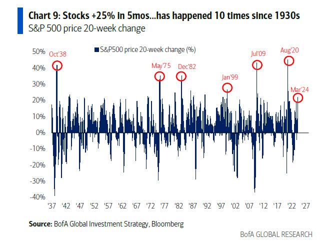
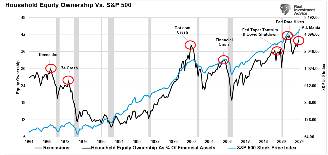
Household equity allocations are once again climbing sharply, driven by the pervasive fear of missing out that fuels a near-panic chase after soaring markets. The recent surge of +25% in just 5 months is a rare event that has occurred only 10 times since the 1930s. What’s intriguing is that this surge is happening at a time when there was no recession in 2023, according to the Biden administration.
“Stocks are up a ferocious +25% in 5 months, which has happened just 10 times since the 1930s. Normally, such surges occur from recession lows (1938, 1975, 1982, 2009, 2020), but, of course, we did not have a recession in 2023, according to the Biden administration. These surges also occur at the start of bubbles (Jan’99).” – Michael Hartnett, Bank of America

The rise in household equity ownership may be an indication of a looming market bubble. According to the recent Bull Bear Report, identifying bubbles in real-time is a challenging task, reminiscent of George Soros’ theory of reflexivity.
“Financial markets, far from accurately reflecting all the available knowledge, always provide a distorted view of reality. The degree of distortion may vary from time to time. Sometimes it’s quite insignificant, at other times it is quite pronounced. When there is a significant divergence between market prices and the underlying reality, the markets are far from equilibrium conditions.” – George Soros
Unpacking the Economic Foundations
To comprehend the current scenario, it is essential to understand that capital gains are rooted in market capitalization, nominal economic growth, and dividend yield.
John Hussman’s formula for calculating returns over the next decade illustrates the dependence on GDP growth, market cap/GDP ratio, and dividend yield.
(1+nominal GDP growth)*(normal market cap to GDP ratio / actual market cap to GDP ratio)^(1/10)-1
If we project a future with 2% GDP growth annually, stable market cap/GDP ratio, and 2% dividend yield, the outlook is less than optimistic.
(1.02)*(1.2/1.5)^(1/10)-1+.02 = -(1.08%)
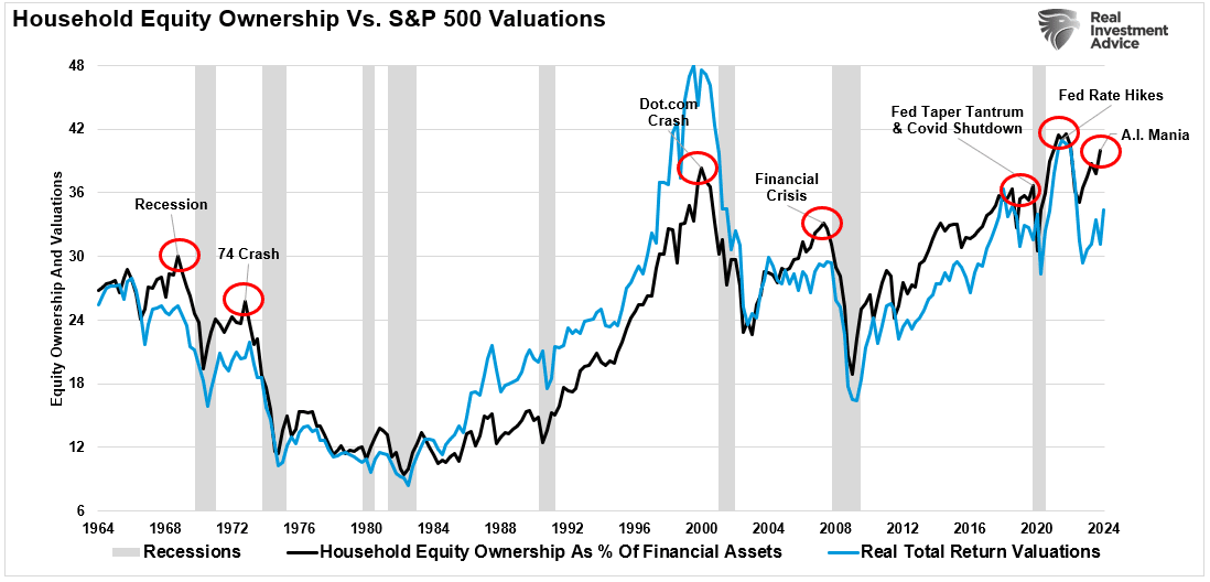
The surge in household equity ownership to record levels indicates a pattern that has historically preceded significant market cycle peaks, suggesting a cautionary tone amid growing exuberance.

If economic growth takes a downturn, the repercussions on valuations could be severe, echoing historical moments when expectations outpaced economic realities.

Investor behavior tends to follow a pattern where exuberance peaks at market tops, leading to cautionary wisdom from figures like Bob Farrell and correlations observed by analysts like Jim Colquitt.
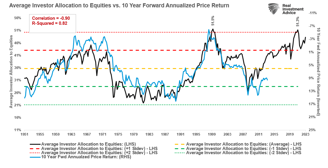
“The graph below compares the average investor allocation to equities to S&P 500 future 10-year returns. As we see, the data is very well correlated, lending credence to Bob Farrell’s Rule #5. Note the correlation statistics at the top left of the graph.” – Jim Colquitt
The correlation between investor sentiment and future returns signals a potential reversion to average returns over the next decade as investors ride the wave of high equity allocations.

As sentiment reaches extremes, the likelihood of market reversals heightens. The words of Sam Stovall on investor sentiment echo the sentiment of a crowded market nearing a tipping point.
“If everybody’s optimistic, who is left to buy? If everybody’s pessimistic, who’s left to sell?” – Sam Stovall, Standard & Poor’s
